When defining or updating activities users can define “Tags” to filter the wall chart data. Use this feature to define a group of activities for “Discovery”, or “Maintenance”, or “QC” for example.
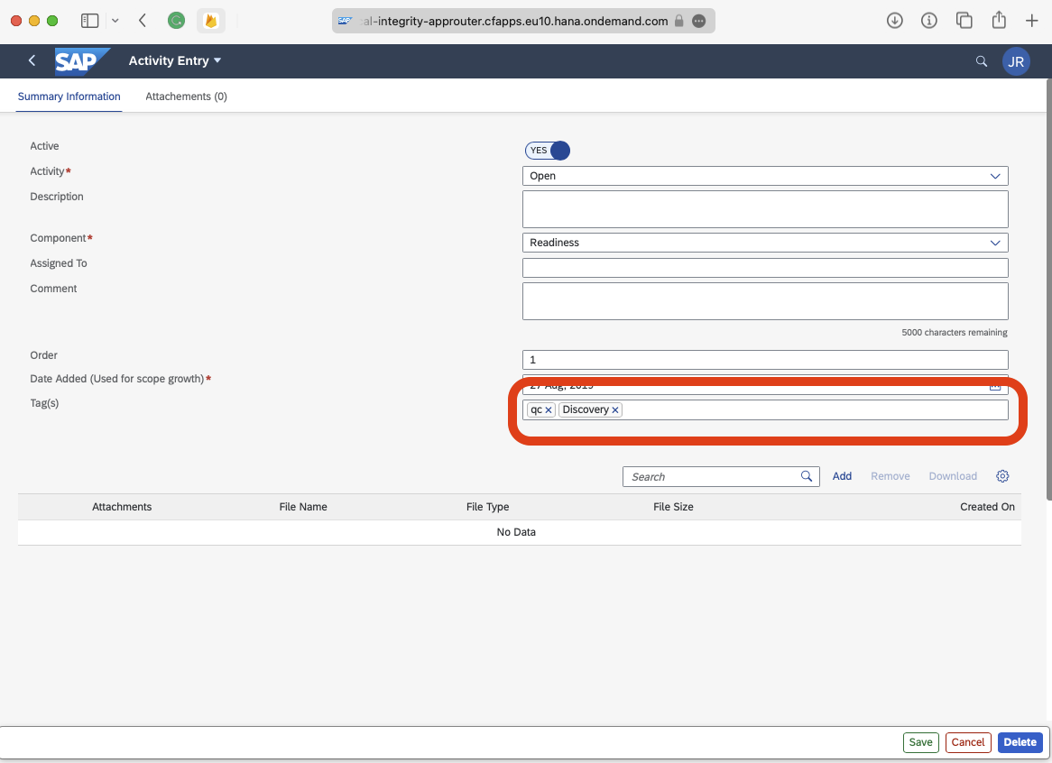
In the Adminstrator detailed activity form, you can see in this image where multiple tags have been defined.
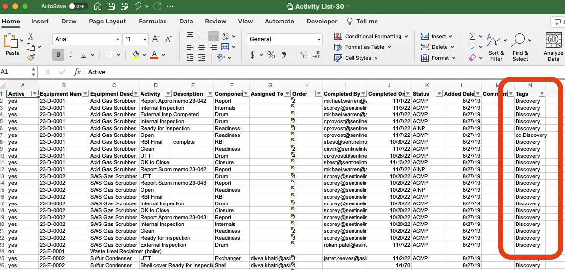
You can also bulk load the tags via the MS Excel workbook. You can separate the tags with a comma if there are more that one to load.
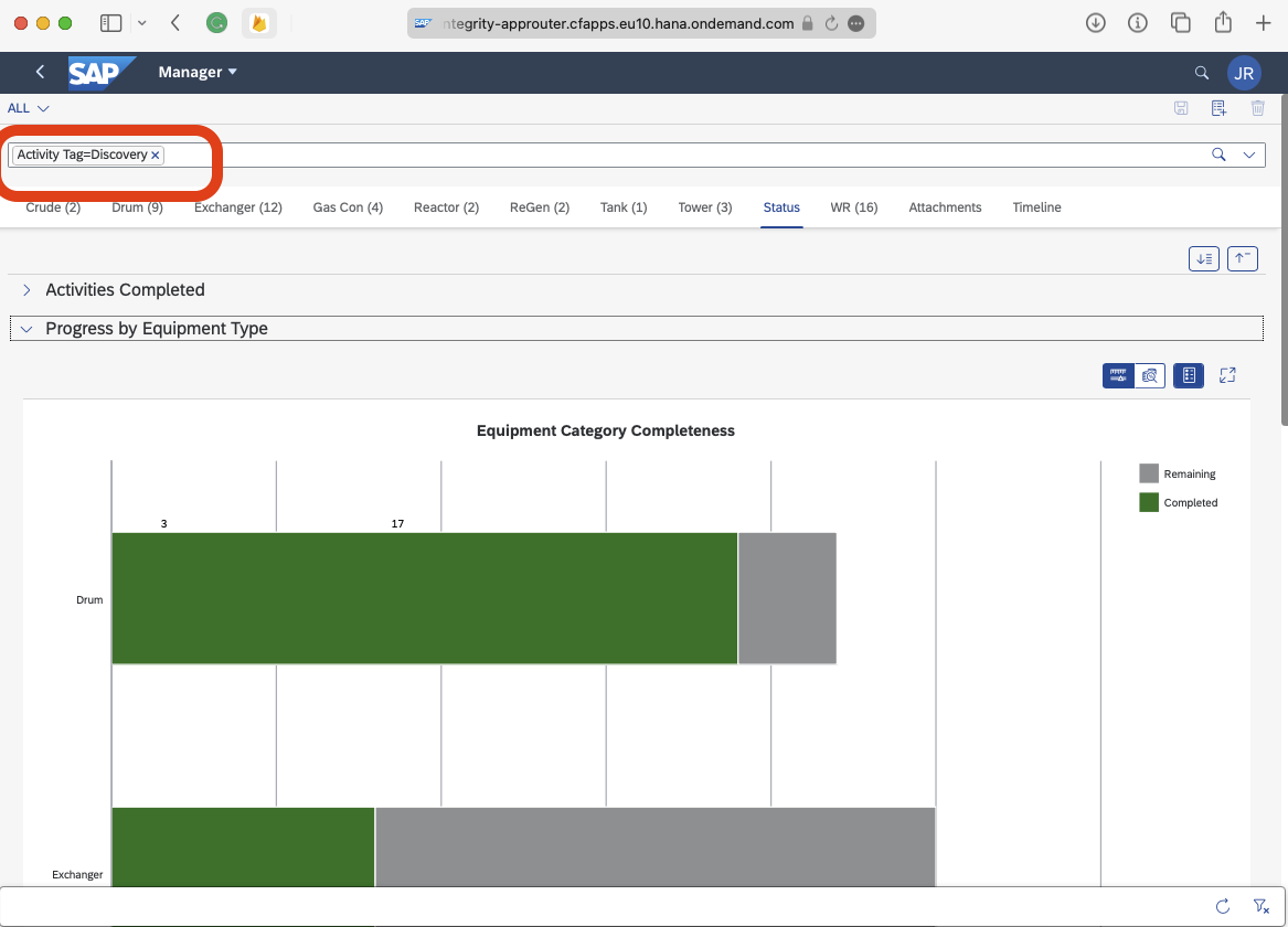
Once tags are defined, you can filter for the tags and only display the activities associated with the tag you are querying for. For example, “show me everything that is marked as “Discovery””. The KPI’s, or status tab, also filters.
Using this feature, user can add Documents or Images for the activities or work requests.
When the user adds the Document or Image to the Activity or Work Request, the document will show on the “attachments” tab of the wall chart.
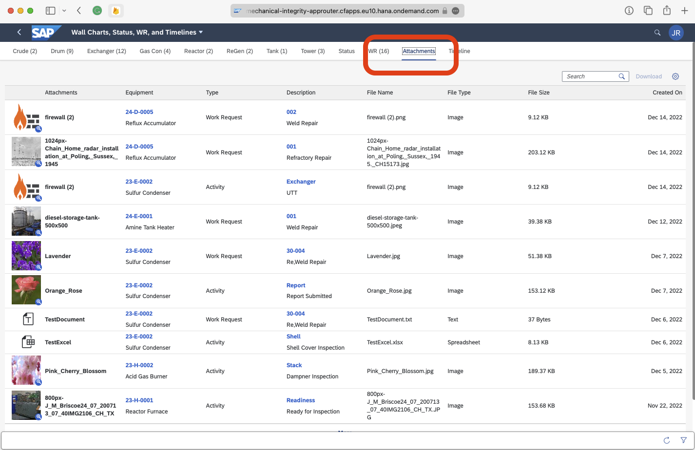
The attachments can be searched, downloaded, and viewed against the Activity or Work Request.
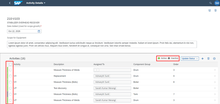
In Administrator App, users can now Activate or Deactivate one or all activities associated with the equipment.
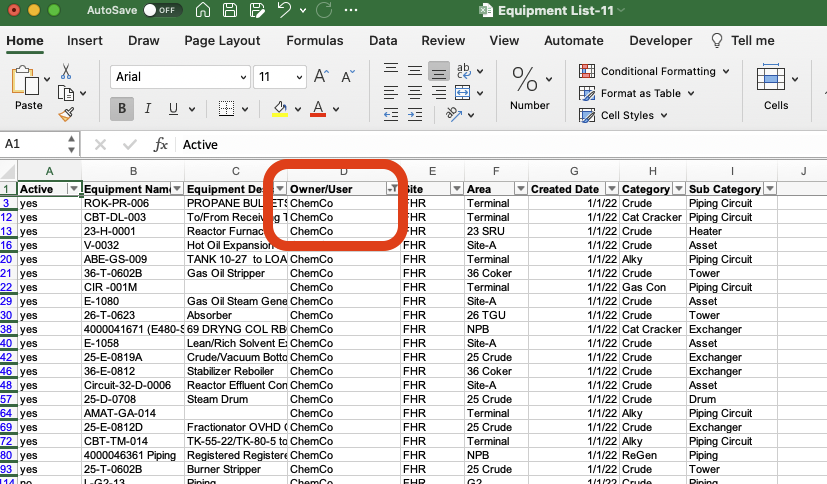
View the Owner/User ID, as well as the Owner/User description while creating new equipments.
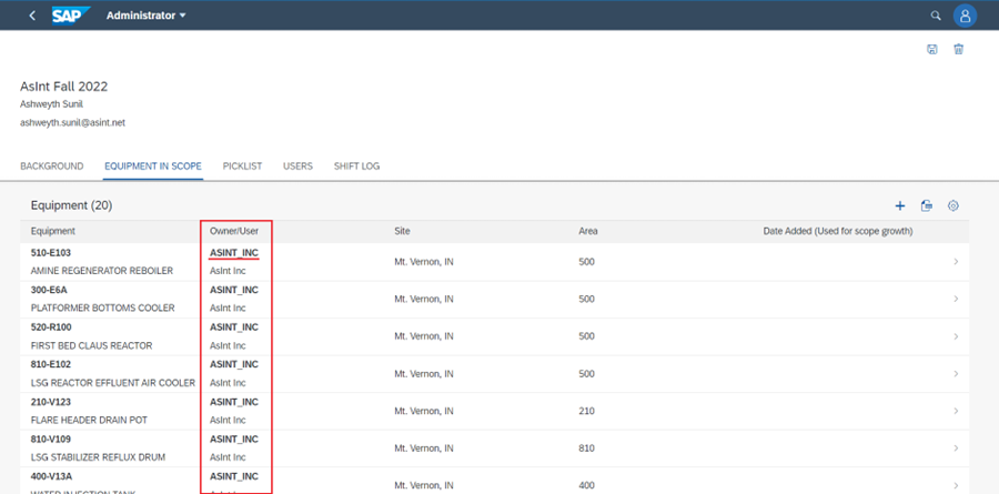
Additionally, on the upload sheet the user will now see “Owner/User” instead of “Operator”. This is the key value that allows the user to assign the Equipment to an Owner/User.
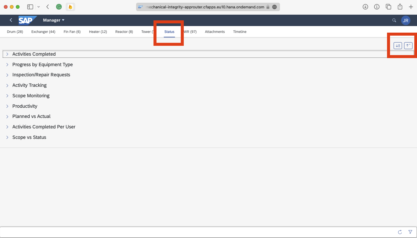
By default, the KPI categories are collapsed. Users can expand on with the upper right buttons.
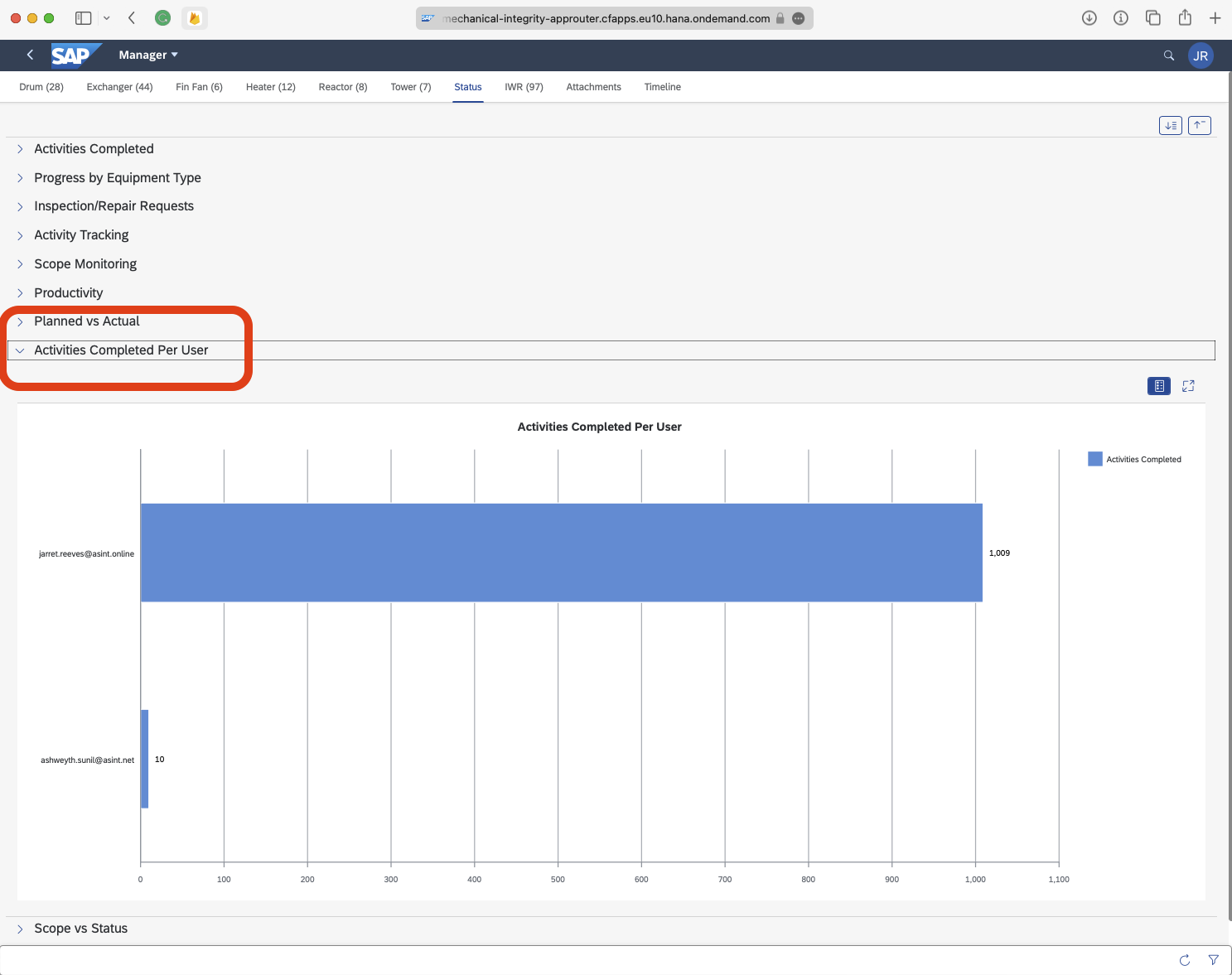
A new KPI that shows the number of activities completed by user.
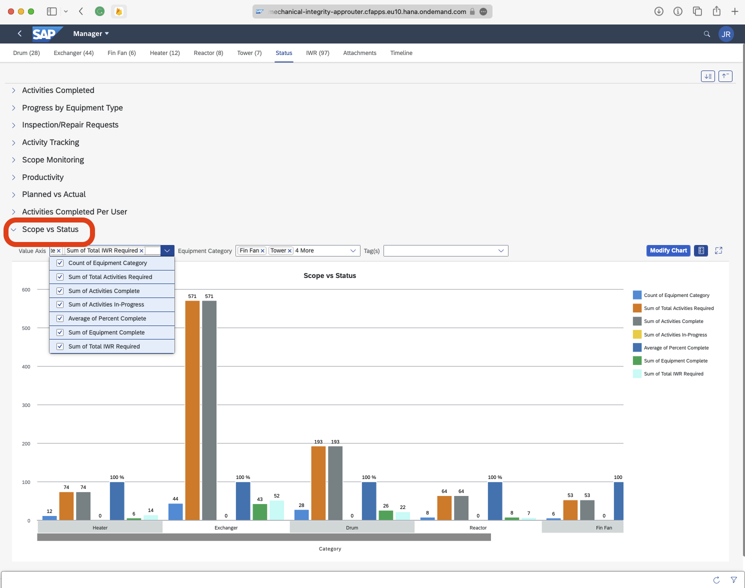
Scope vs Status shows the count of equipment per equipment category, as well as the number of activities complete, in-progress, and number of work requests. Users can modify the graph by removing aggregations, adding aggregations, and filtering by tag.
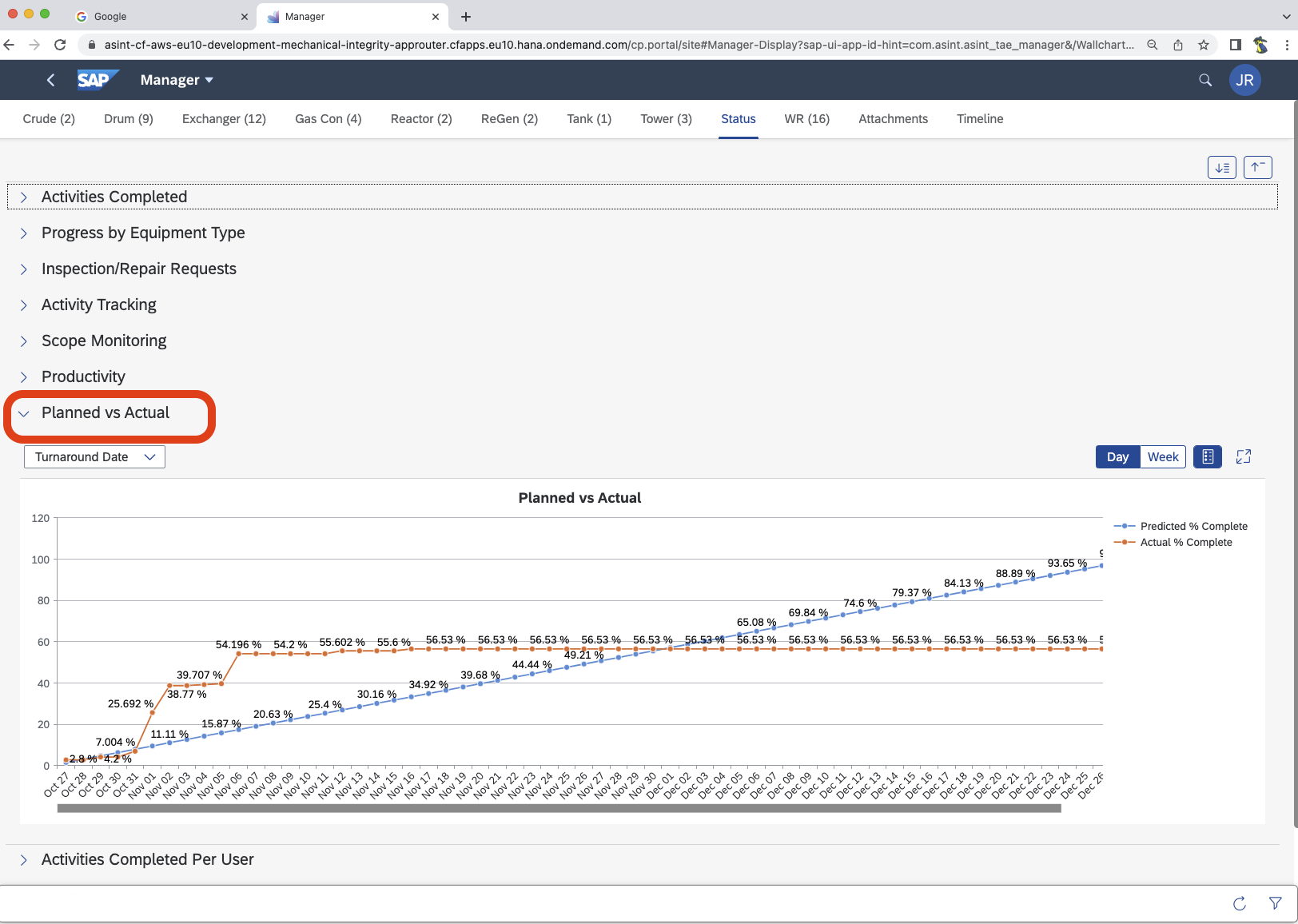
Planned vs Actual will plot an estimated number of activities spread out over the length of the turnaround, this is the blue line. The orange line is the actual aggregated activities complete. This is the traditional project S-Curve.
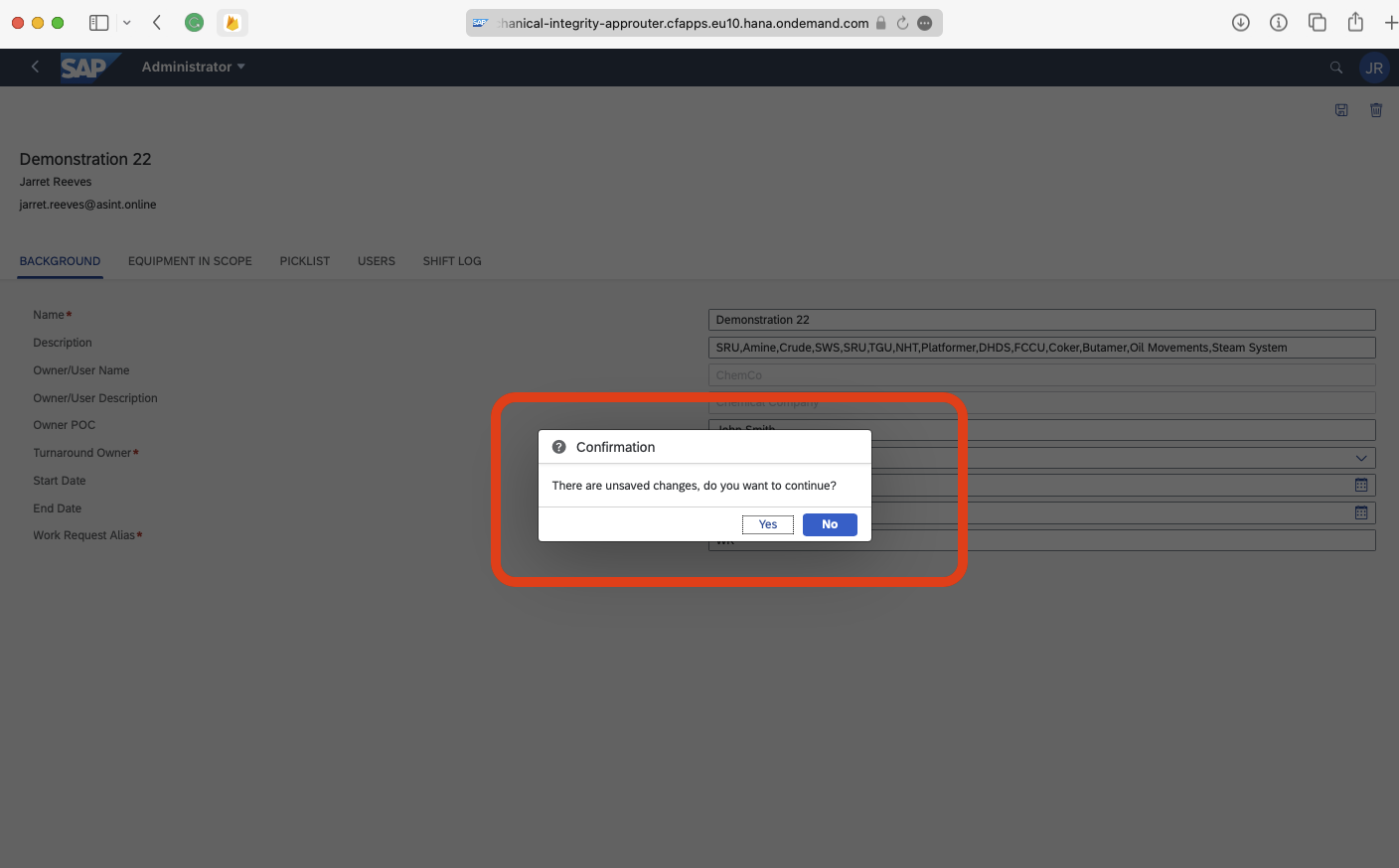
Within the Administrator tile, now when the user changes data and attempts to move off of the form without saving, the user will be prompted to save or cancel.
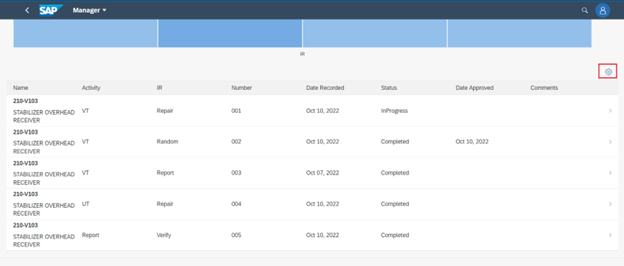
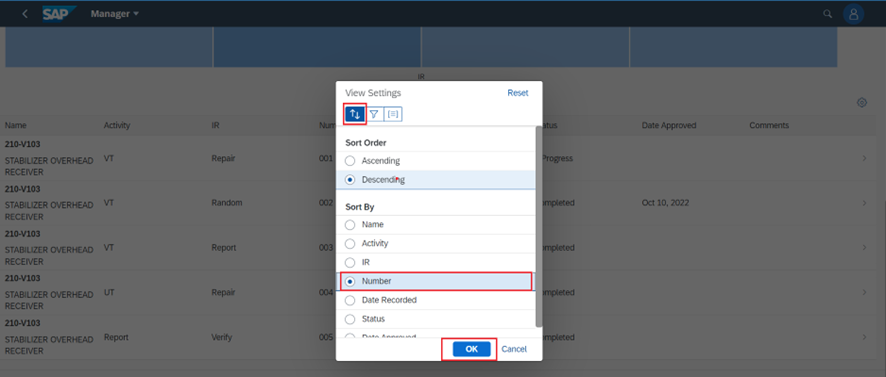
When viewing the Work Requests dedicated tab on the wall chart, the user can Sort By, Filter By, and Group By the “IR” (Work Request) list.